Pages

Thursday 13 March 2014

Magazine Evaluation

Answer the following questions relating to your magazine cover...

1.What two conventions have I used & Why?

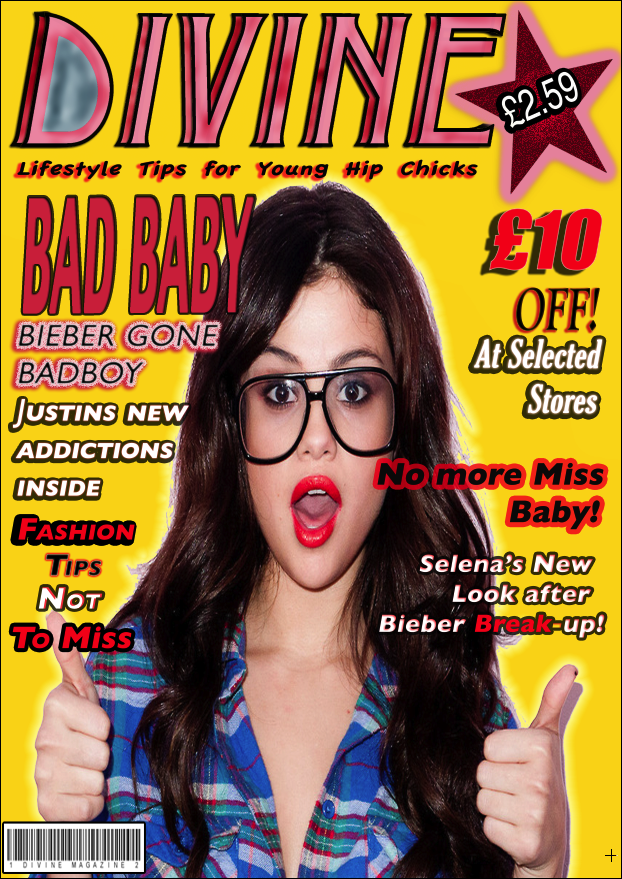
As my magazine is for a young teenage girl audience, I have chosen Selena Gomez as the front cover. I have also used a great amount of girly colours such as: Pink, Gold and Red. This allows the magazine to really stick out as the array of colours are vibrant and glowing. 

2.What are the effects of my Layout, Typography, Colour choice and Language Choice
My the layout of my cover is symmetrical and relatively ordered showing some form of sophistication and giving the reader an easy ability to read the articles and headings. It also shows girls a view on how they should act and dress this links to the idea of Selena Gomez with Geek glasses, this shows the young teenage girl audience it is ok to be a geek and dress well/be popular at the same time. In terms of my Layout and the typography, I have used bold colours to allow my magazine to bring in an audience that are are attracted to bright colour and bold writing. The Font I have chosen and used gives the magazine a bold look and attracts the reader, I use hot pink colours and reds to attract girl readers as these colours appeal more to them. The Connotation of this magazine shows a girl based theme as the colours used are looked at as more girly. The text is also sans-serif this is all the bold text to stand out and also usually associated with young people. Hot pink is a vibrant colour used by developers in relation to girls ideally in clothing, makeup and accessories. Red is a sexual colour and brings in girl audiences as it emits a bright glow and is found in more female/girl based accessories and clothing. I have finally used Black and white with Pink and Red as these colours match in terms of making the magazine bold even further and stick out to the audience more. The Language of my magazine also gives the magazine a informal look to the magazine, this is again for younger readers and also I use short phrases on my magazine title to allow the reader to read the titles fast

Tuesday 4 February 2014

Magazine Titles and Cover Lines


Azure

Mystique

Twilight

Destiny

Cascade

Evocation

Tranquility

Ethereal

Celestial

Devotion

1) Bad Baby Singer Bieber banged up

2) Twerked up Twerp

3) Fashioned New Fragrance

4) Top 10 Hunks and Heartthrobs

5) Luscious lips and stylish tips

6) Fashion Tips for Funky Chicks

7) Your not an ordinary girl!

8) What Lifestyle does your month bring?

9) Tips and Tricks for your romance

10) Taylor Lautner Hunky Husky

Tuesday 28 January 2014

Balance

Symmetrical
This image represents symmetry in a magazine cover. The image of this women is almost the same on both sides, this includes hair colour the black head band and also the makeup is the same colour. Moving down to her body the outfit she has on is positioned almost equally with the shoulders almost in the same on either side, along with the colour of the outfit and finnaly the V in the middle splitting the page equally down the middle where her face lies.
Asymmetrical by shape


This edition of Oprahs magazine shows the shape with her hair taking up one corner of the page. The shape is also like an O as you can see her face in the centre of a giant circle/her hair. This is also a representation of the O on the left of the magazine standing for Oprah.


Asymmetrical by Colour.


This is a edition of Gloria magazine that displays a nice use of colour that gives the magazine that point that sticks out. The red with the black background attracts the attention of the reader and displays brightness to the magazine that would otherwise look dull.
Also where the women in red is placed in the centre of the magazine it brightens up the entire cover.
Asymmetrical by Texture


This is a GQ magazine that with its vibrant array of colours and the texture that gives the who cover a canvas look, can draw in almost any audience, someone interested in art for example rather then lifestyle may pic this magazine up from the colours and textures, and again the canvas texture gives the magazine an authentic, unique look.


Asymmetrical by Value


This issue of Cosmopolitan shows a sense of Value when in terms of what the women looks like and the sexy hot pink colour in the background, the women in this image shows a dark being, this makes her stick out in a light background. She is also tanned, this shows her being the perfect tanned colour for women to bring out their "beauty". The perfect curves in her body also give great attraction. The work on her body, increases value in looks and sexuality bringing gaze upon her by many audiences.


AMBER


This is a good start and you have the basics here. However, this is not finished as there are other types of balance to find...

Tuesday 7 January 2014

5 Lifestyle Magazine Front Covers.

The worlds in this magazine stick out with manly colours, these colours as you can see are Red, Navy Blue, Cyan, Yellow and Green. The Most attention building areas in this magazine are the bold worlds and the image of the man who is in a muscular but intellectual position, showing of his reserved intelligence but also strength. The Navy Blue is used as the colour for the bold font, this colour is mainly a manly one. This can shade of blue is mainly linked the type of clothes men wear and also a colour they would have their cars be. Having LEAN MUSCLE FAST! stands out more then Lean Muscle Fast. The colour generally brings attention from men as the majority of them either have Navy/ Dark Blue/Black cars, and men also wear Jeans a lot in a casual environment. Cyan is a Bright Blue colour that also attracts the reader, the things that I can see are Cyan are Numbers and statistics. The navy blue is also high-lighted in Yellow, this indicates that the sections high-lighted are important or most looked at by the men who read the articles. The Red in this magazine indicates a Strong, dangerous and manly element to the magazine. It can  also give a sexual view for example something in red is "SEX TONIGHT" and even the title with its attractive red look attracts buyers and enable the magazine to draw people in with its vibrant array of colours.


This Edition of GQ Magazine brings no difference in representation of women to any of their other magazines, with their regular use of sexually alluring women on the front cover it doesn't fail to attract their target audience. The colours used on this cover are plain but with its vibrant background fails to show not enough attraction when drawing people into buying the magazine. The casual Black and White colour is retro in the idea of giving GQ magazine a unique look, the odd use of Yellow gives the main points that the editors are trying to get out to the reader a more attractive view, the Yellow also high-lights Jennifer Aniston's name just to appoint who she is to the reader. In this magazine from this cover all you can see that is in the magazine from the perspective i'm in


AMBER


This is a good start and you have a really great level of analysis at this point. However, this is not finished and needs to be.